 United Kingdom - English
 United States - English
 Ireland - English
 Netherlands - Dutch
 France - French
 Germany - German
 Italy - Italian
 Spain - Spanish
 Belgium - Dutch
 Portugal - Portuguese
 Singapore - English
 Malaysia - English
 Australia - English
 New Zealand - English
Reporting – Kinesis Pro user guide
Kinesis Pro comes with a standard report, but adding a custom report and seeing insights on your dashboard is completely configurable using rule sets. It’s easy to set up and highly powerful.
Table of content
1. Manual reports
1.1 Introduction
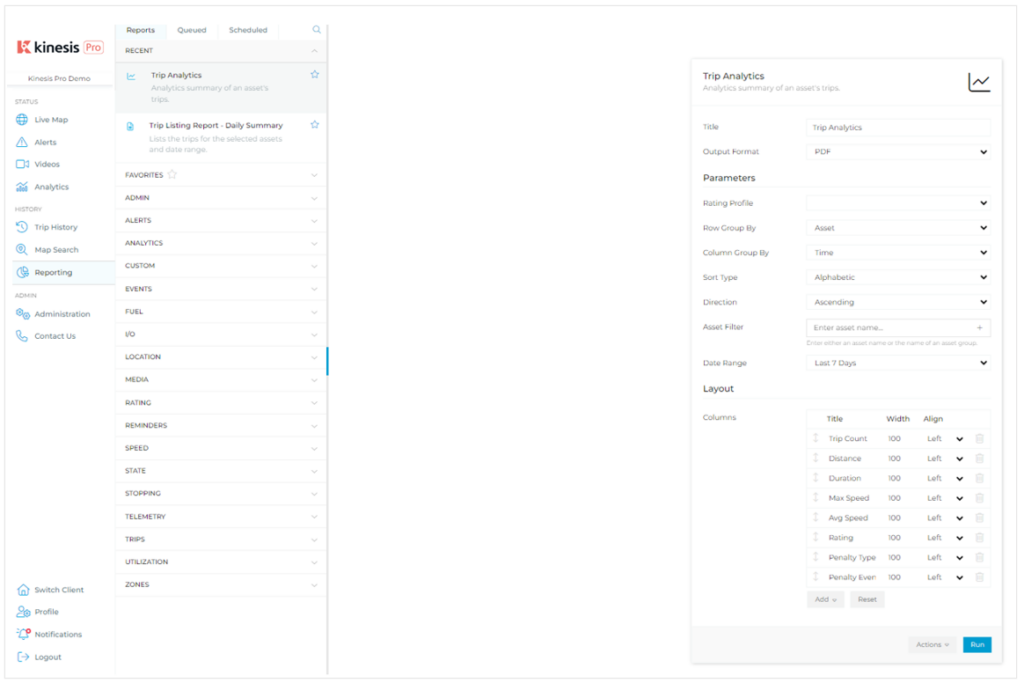
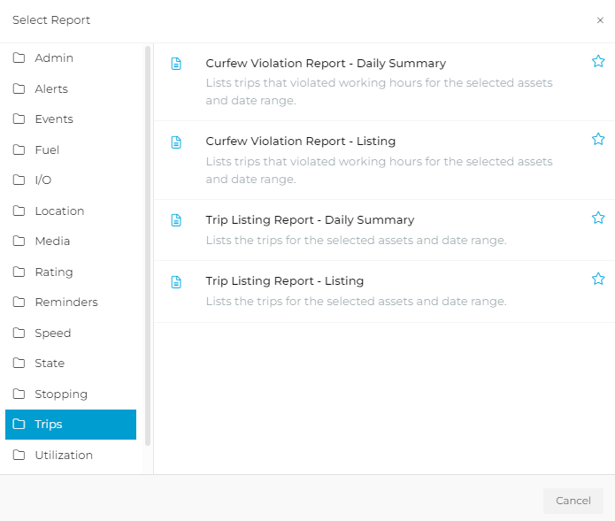
The platform contains a pre-defined list of Reports that Users can choose to run. All Reports are grouped by the type of data they contain. Once you choose a Group and a specific Report, you can edit the information and either (1) Run the Report, or (2) Save the changes as Template. Here are some of the functions within the Reporting section explained:
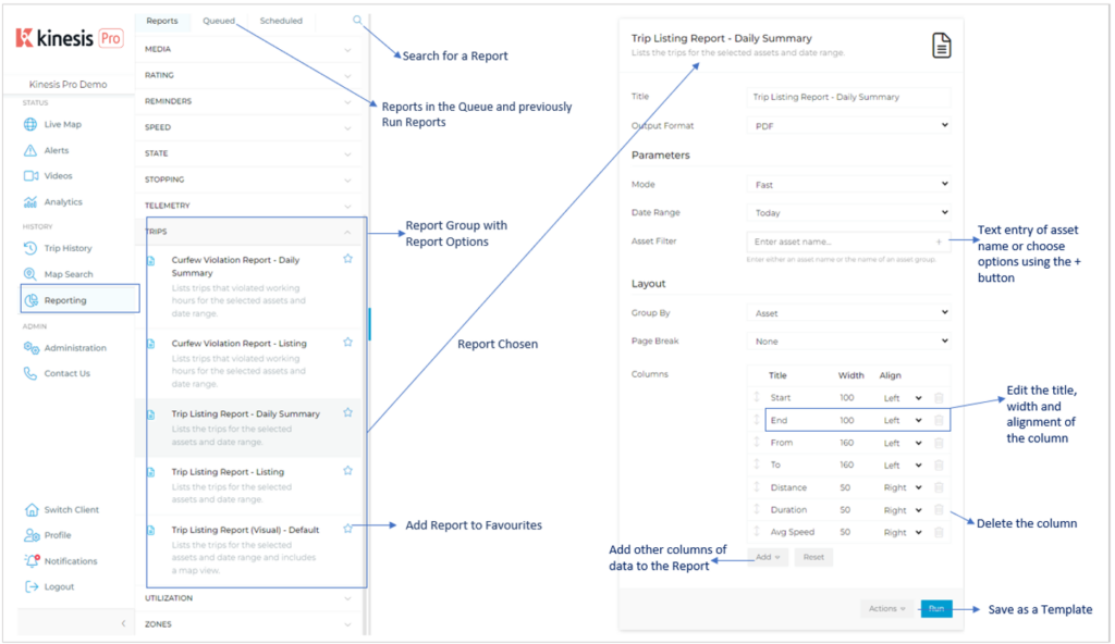
1.2 Running a Manual Report
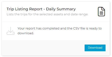
Choose the Report from the relevant section, add and edit all the information as required, then click Run. The report will appear on the screen on the right if in PDF format, or you will be advised to download the Report, if run in csv.
Some tips for editing the information in the report:
1. Name the report something unique to find it if you need to re-download the data, run it again, or save it as a template.
2. You can edit the columns’ titles and alignment, which means you can change the names according to you and your customer’s needs.
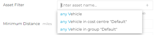
3. Type in the name of the asset you would like to run the report on or the Cost Centre, or type “Any Vehicle / Driver” for all vehicles/drivers
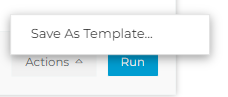
4. Once you have entered all the information, you can save the report as a template, which allows you to run it with one click or add it to scheduled reports
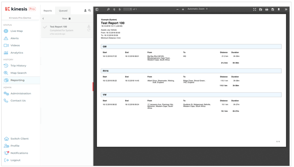
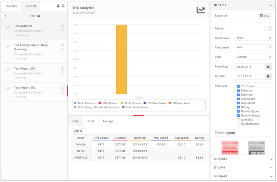
1.3 Re-running a Recent Report
Reports recently run will appear in the Recent section and can be re-run or edited from there. The information added when run will appear, pre-populated, in the Report. Click the Report, change the information as needed, and Run again.
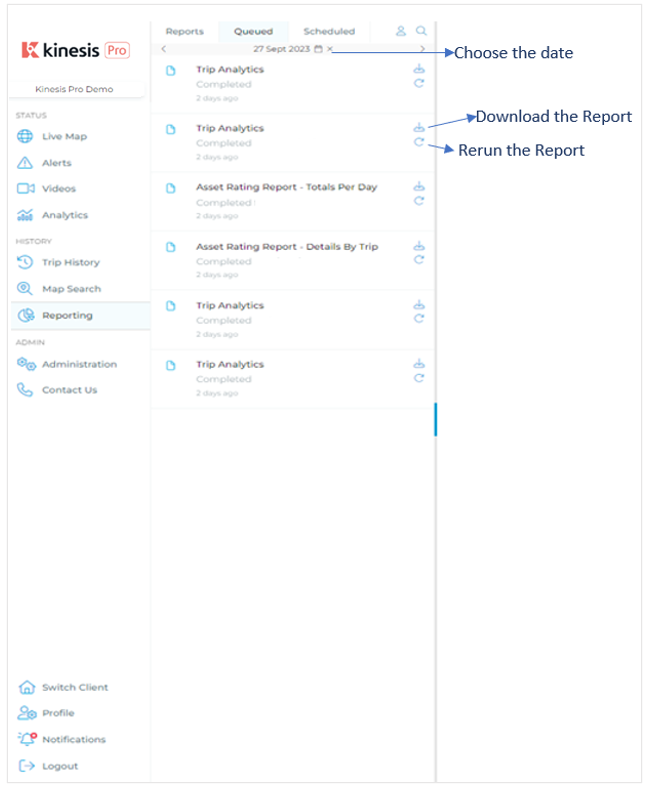
1.4 Opening or re-running a previously run Report
If you would like to re-run a Report from another day, or re-download the Report, navigate to Queued, choose the date when the Report was run, and choose to either download or run the Report again:
1.5 Adding Driver Names to Reports
Drivers can be added to the following Reports as a linked item to the primary Asset, but only in Listing Report Style format. Click Add, and look for Driver/Linked Asset in each Report:
- Curfew Violation Report
- Over Speeding Report
- Trip Listing Report
- Idling Report
- Zone Report
Choose the Vehicle Asset as the Asset Filter, not the Driver, when running the Reports.
2. Analytics Reports
2.1 Introduction
Kinesis Pro contains a pre-defined list of Analytics Reports.
The output for these reports is a combination of either PDF or csv files and charts. Charts can be edited and shared to graphically represent the data in a Dashboard in a Widget.
Charts are created and edited using powerful tools – the end result will be added to the Dashboards of choice and will update daily / monthly, per the time frame chosen. Therefore, it is important to use the tools correctly and edit the chart in a way that makes sense to those viewing it.
2.2 Running an Analytics Report
The Analytics Reports are grouped under the section Analytics and are run the same way as normal Reports. Choose the Report you would like to run and edit the parameters accordingly.
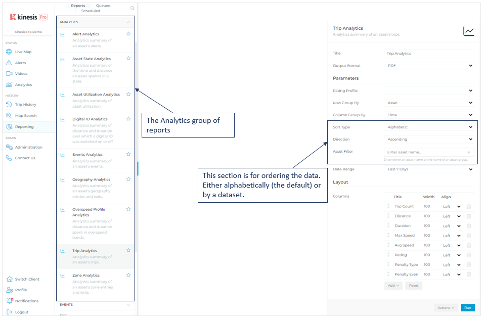
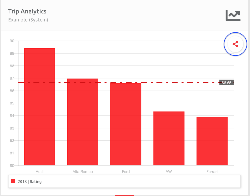
In the example above, the report will sort the data by Rating per Asset from top to bottom.
2.3 Editing an Analytics Chart
The Analytics charts can be edited in multiple ways, and the data displayed accordingly. The default view is the chart with the Table menu option open.
You can adjust the Asset Level, Time Level, Time, Measures and Table Layout options in the Table menu option. The screenshot below shows the first output of the chart after running a Report. No columns were removed when running the report. Hence, everything is checked under Measures.
Here is an overview of the workspace where the data is displayed, edited, and downloaded:
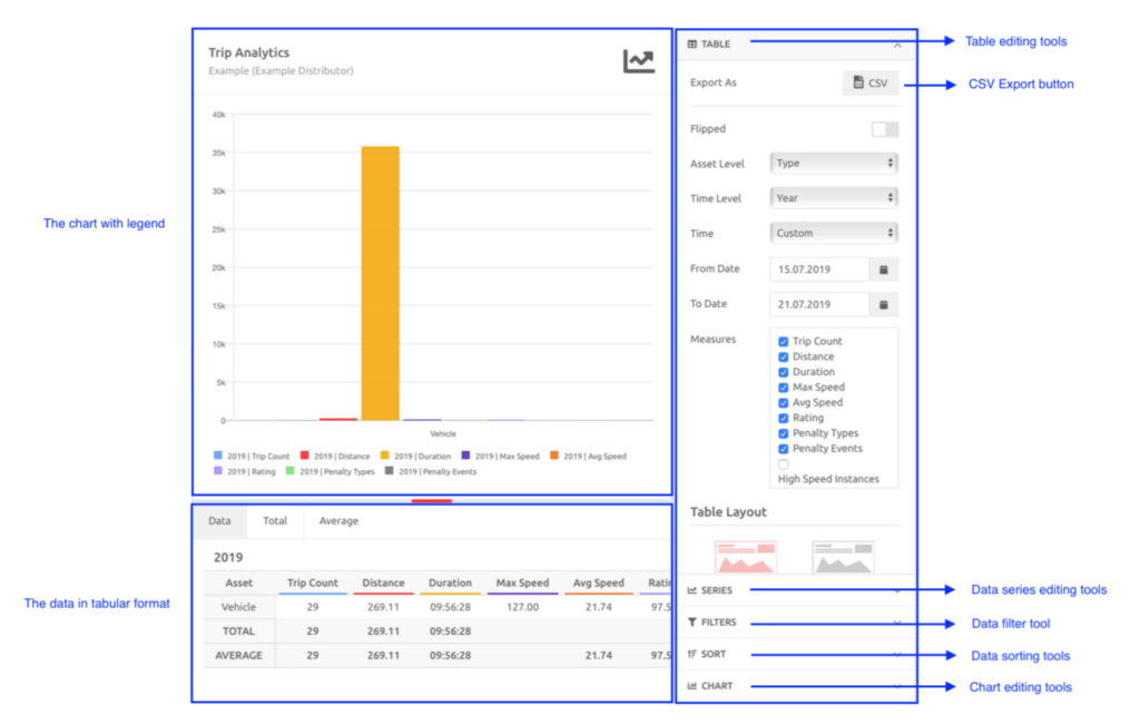
TABLE
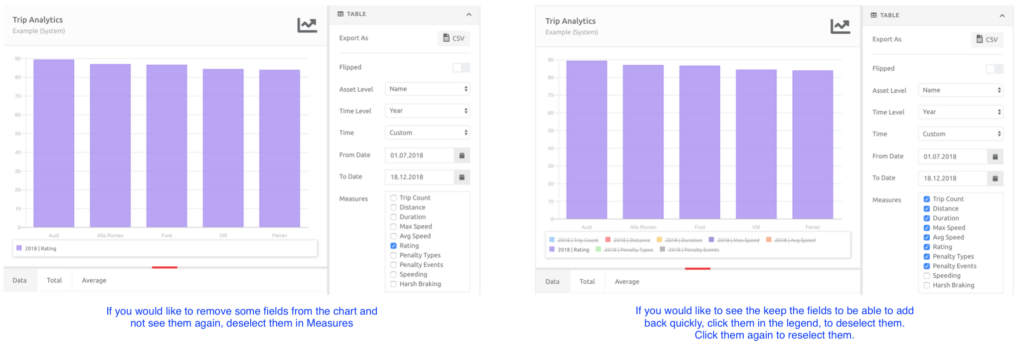
Once you have decided what data to keep in the chart, you can choose to either (1) deselect the unnecessary fields in the Measures section or (2) click the name of the field in the legend: the text will have a “strikethrough” and the data will disappear from the chart. See the example below, where the only other item we changed was choosing Name for Asset Level:
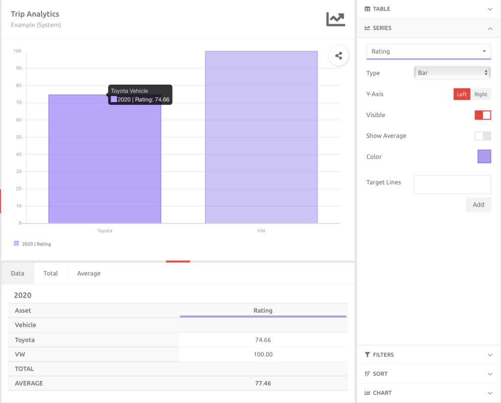
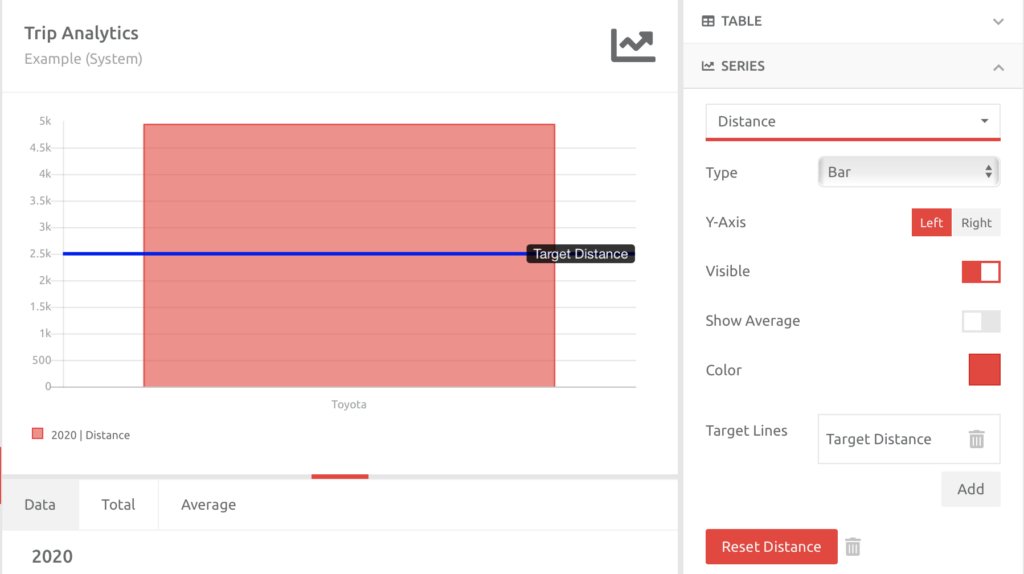
SERIES
Clicking the bar chart will navigate you to the Series menu option, where you can edit the data series. This includes the ability to
- change the series from a bar to line,
- move the data from the Left to Right Y axis, which is useful if there is more than one series on the graph,
- add an Average line,
- change the colour of the data series, and
- add Target Lines to the data series:
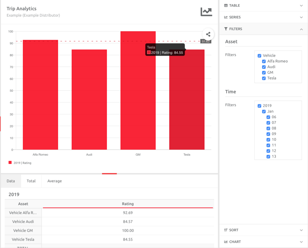
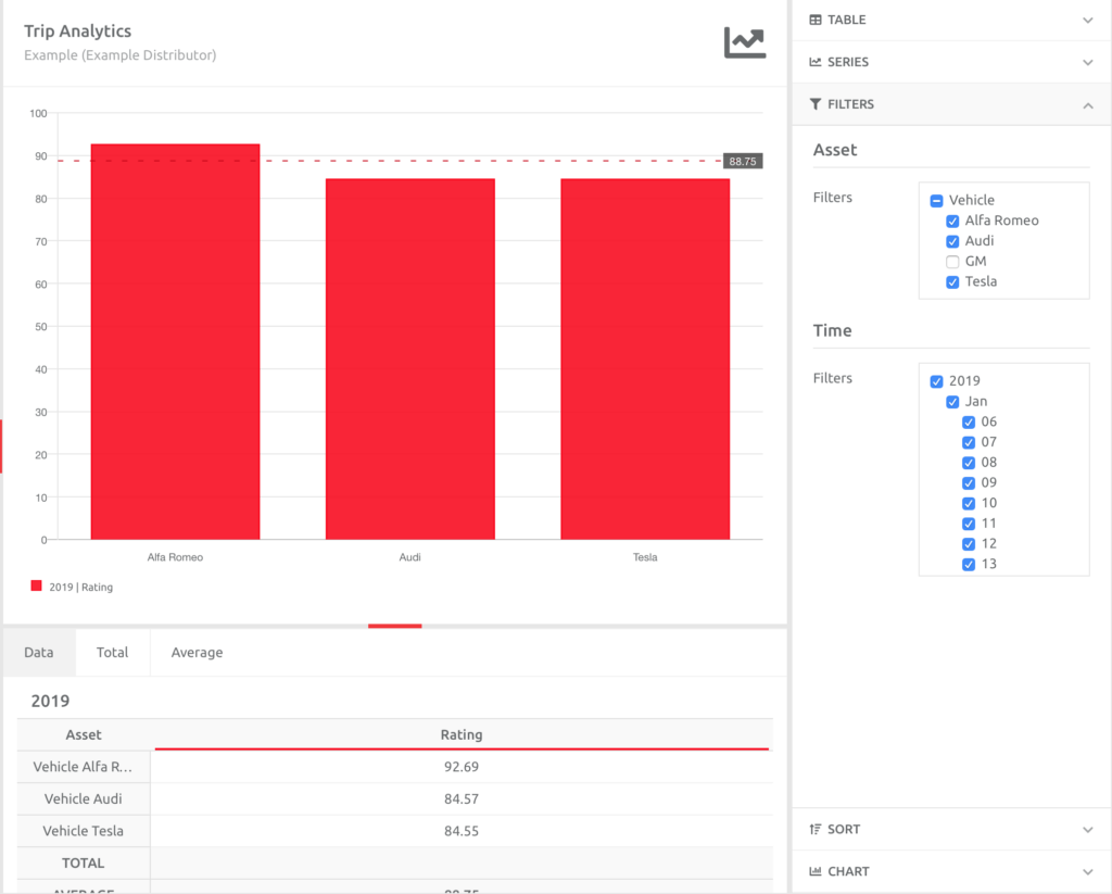
FILTERS
The data can be filtered. For example, if there is an asset that is skewing results, this can be removed by unchecking that asset’s name. The date can also be filtered by the column option. Time was chosen in the column in these examples, and specific days can be included/excluded as necessary. The totals and averages will adjust accordingly. The GM was removed, and the average changed for the remaining assets:
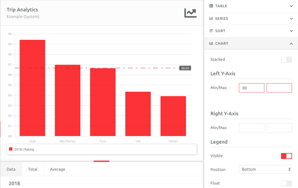
CHART
You can also change the way you have sorted the data in the Sort menu option and change your axes and Legend in the Chart menu option:
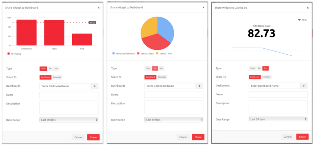
Once you are happy with the Chart, you can Share it to a Dashboard. The Share option appears on the chart when you move your mouse over the chart:
A pop-up will appear, and you can choose
a. the Type of Widget to add to the Dashboard,
b. whether to add the item to a Dashboard or Template,
c. which Dashboard to open it on,
d. give it a unique Name, and
e. a Description.
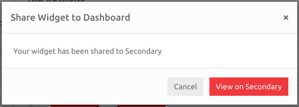
Click Share, and then View on the Dashboard, or Cancel to run another Report:
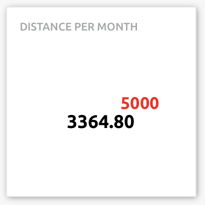
Hint: Pie charts and Single Stats are best used for single stats or comparisons of one item to another (e.g. month to month). In the example below, the above data has been flipped, and the vehicles aggregated to give monthly rating averages for all the vehicles, which can be compared against each other.
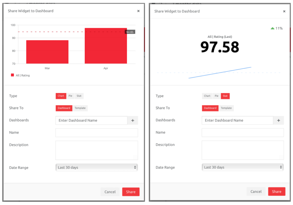
A target can also be added to a Stat once saved onto a Dashboard, allowing the User to see the goal for the item in question:
3. Scheduled Reports
3.1 Introduction
The platform contains a scheduling engine that allows the ability to run Reports at a set time and email these to any User in the Client, either once off or on a repeated schedule.
Scheduled Reports can be created in the Reporting section as well as from the Administration section of the platform. The flexibility of allowing Users to schedule Reports from either of those two sections means that:
A User can schedule a Report from the Administration section if busy with another task in Administration instead of having to leave Administration and open the Reporting section.
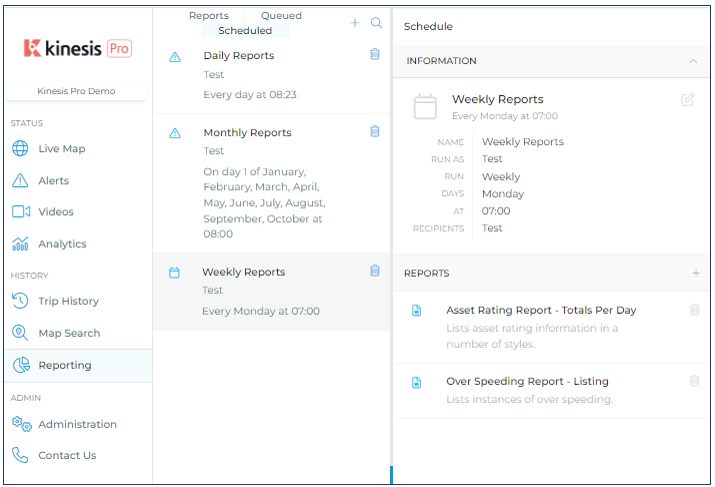
There are two parts to scheduling Reports, namely:
1. Create a Schedule, and
2. Add the Report/s to the Schedule.
3.2 Create a schedule
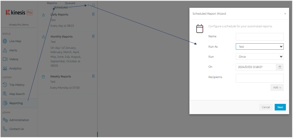
1. Go to Reporting under History,
2. Choose the Scheduled tab,
3. Click the Plus button,
4. Enter the information in the Wizard.
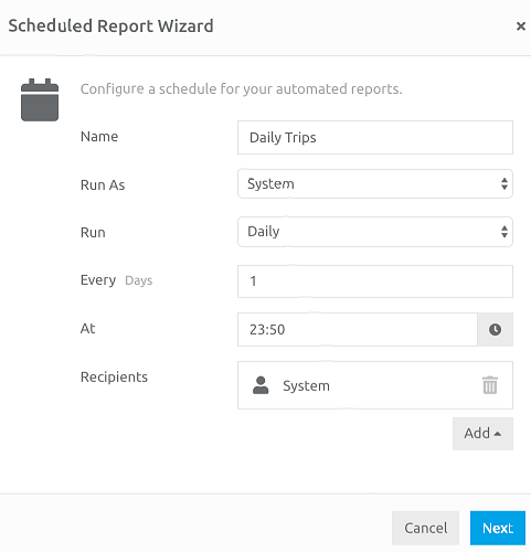
The information entered in the Wizard tells the platform when the Reports should run and who, if anyone, should receive them by email. By default, the user creating the Schedule is added to the Recipients list. You are able to add Users or groups of Users based on their User Role.
Once a schedule has been saved, you can also add an Email Address of a recipient:
Edit the information to create a unique schedule, then click Next, and complete the set-up.
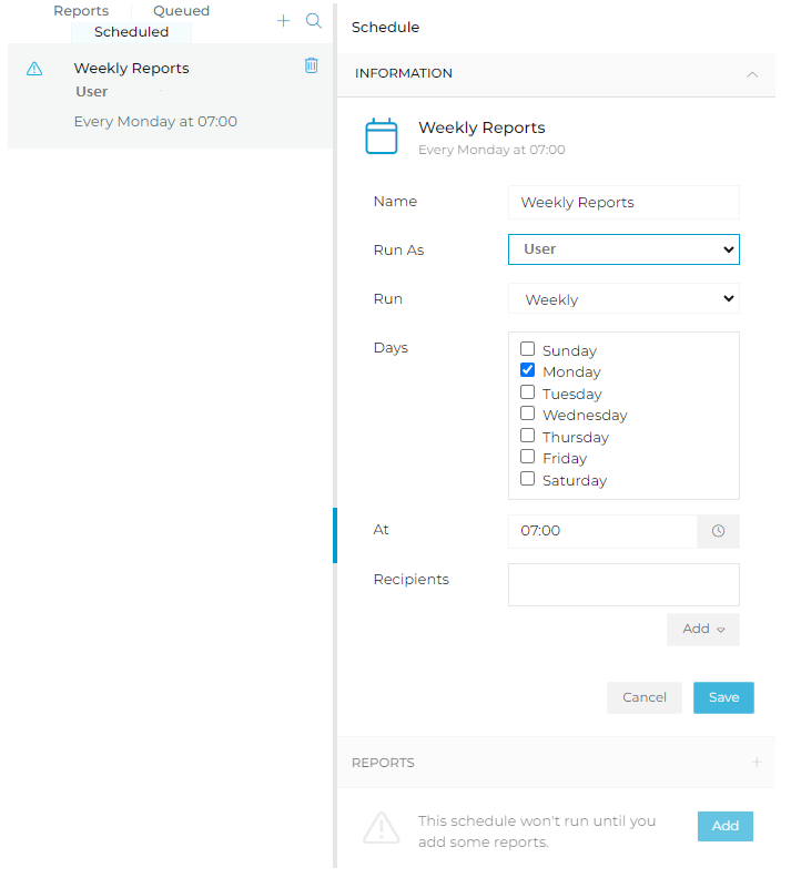
The schedule will appear in the list, and the Information tab will be open. Underneath this, the REPORTS section will be blank, and a message will state that the Schedule won’t run unless reports are added.
3.3 Add the Report/s to the Schedule
Click the Add button to add a report:
Choose the type of Report you would like to add to the schedule, and then complete the parameters for that Report:
After you choose the parameters and click Ok, the Report will appear in the Schedule. To add another Report, click the Plus button on the right-hand side of REPORTS and complete the procedure as outlined above.
Keep learning
Need help?
Use our help me choose wizard or contact us on one of the options below.